Golf Logo – Meaning, History, Famous Examples & Design Insight
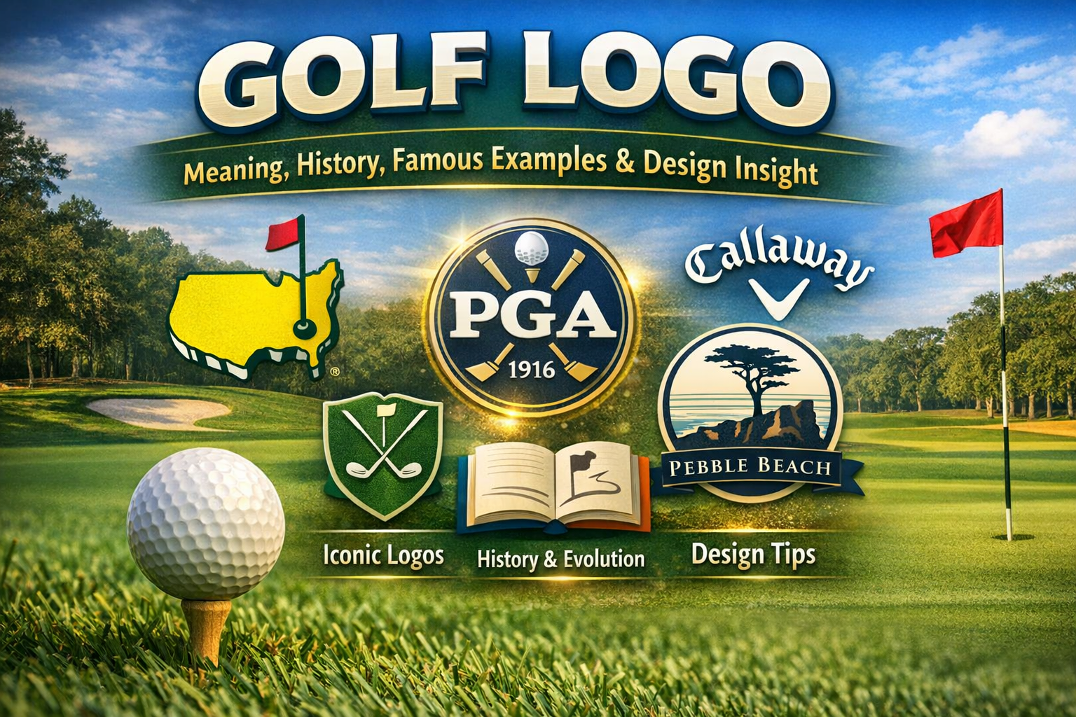
The Masters golf logo shows the map of the USA with a flagstick, a classic golf logo example.
A golf logo carries more meaning than just a symbol on a hat or shirt. It represents identity, heritage, and visual language for clubs, tournaments, and brands connected to one of the world’s oldest sports. Whether you see it on a tee box, a tour trophy, or the side of a driver, a golf logo tells a story about tradition, excellence, and the culture of the game. This article breaks down real designs, historical roots, famous logos, and what makes them effective.
Below is a quick snapshot of what this article covers and why golf logos matter so much in the sport today.
| Category | Description |
|---|---|
| Focus Topic | Golf logo |
| Primary Use | Brand identity for clubs, tournaments, equipment |
| Strongest Associations | Tradition, prestige, performance |
| Most Recognized Logos | The Masters, PGA of America, major brands |
| Common Elements | Clubs, balls, flags, crests, typography |
| Design Trends | Modern minimalism and heritage revival |
What Is a “Golf Logo”
Understanding the Core Identity
A golf logo refers to the unique graphic mark that identifies an entity connected to golf. These entities might include professional tours, historic golf clubs, major tournaments, or even equipment and apparel brands. A strong golf logo does more than identify; it communicates values such as excellence, heritage, prestige, and the spirit of the sport itself. Often featuring a golfer, clubs, a ball, or nature imagery tied to iconic courses, these symbols help fans instantly recognize an organization or event.
For example, when you see the familiar outline of the United States with a flagstick denoting Augusta National on a piece of merchandise, you immediately think of The Masters. That’s the power of a great golf logo—it becomes shorthand for experience, tradition, and achievement.
History of Golf Logos
Origins and Evolution
From simple emblems on early 20th‑century golf club stationery to today’s polished digital marks, the design of golf logos has evolved alongside the sport’s growth. Initially, golf logos were literal: crossed clubs, golf balls, crests with letters, or silhouettes of golfers mid‑swing. These designs reflected an era when prestige and tradition were paramount, and clubs proudly displayed civic or historic elements that bound the sport to place and community.
As golf expanded globally, these marks adapted. Designers began to combine visual simplicity with symbolic depth. Instead of a complex crest, many modern logos now use clean lines, minimal shapes, and iconic imagery that works on digital platforms, fabric, and physical signage with equal clarity.
Iconic Golf Logos and What They Represent
The Masters – Tradition Meets Geography
A standout example of a powerful golf identity is the Masters Tournament logo. This emblem cleverly uses a stylized map of the United States with a red flagstick inserted at Georgia’s location—home to Augusta National Golf Club, the annual host. The simplicity of the design makes it instantly recognizable to fans around the world.
The Masters logo’s colors—rich green, bright yellow, and red—echo the lush course, the azaleas, and the championship’s long tradition. Although the precise origins of the original Masters mark are rooted in decades of evolution rather than a single documented moment, its presence on everything from tournament posters to apparel means that fans associate it with the sport’s most revered major.
The Masters logo is more than a mark—it’s a symbol of legacy every spring when golf’s best gather for one of the oldest and most respected tournaments.
PGA of America – Professionalism and Authority
The PGA of America logo showcases a circular medallion featuring crossed golf clubs and a ball. Introduced in its current form in the early 2000s, it emphasizes both tradition and professionalism. The use of strong lines and a badge‑style shape conveys authority and history. The color palette—typically gold and navy—suggests luxury and respectability, fitting for an organization that represents thousands of club professionals and organizes major events like the PGA Championship.
Unlike logos that feel playful or trendy, the PGA of America’s mark aims to convey seriousness, continuity, and respect for the sport as a profession.
Golf Brand Logos You Should Know
How Equipment Brands Build Identity
Many golf equipment and apparel companies have logos that serve as their visual signature. These marks often appear on clubs, bags, shirts, and even digital ads, so they must be simple, versatile, and meaningful.
| Brand | Logo Style | Brand Message |
|---|---|---|
| Callaway Golf | Elegant serif with stylized “V” | Tradition and innovation |
| Ping | Bold wordmark | Reliability and performance |
| Titleist | Script wordmark | Classic and trusted |
| TaylorMade | Modern, angular mark | Innovation and technology |
| Honma Golf | Minimalist typography, red accents | Premium craftsmanship |
Callaway’s logo springs from a desire to blend heritage with performance, while Ping’s bold wordmark prioritizes clarity and brand recognition on equipment. These designs must work on physical gear and in a digital context without losing identity.
The success of these brand logos demonstrates that a golf logo must function across different mediums—whether stitched on a hat, embossed on a club shaft, or displayed on an online storefront.
Golf Course and Club Logos
Place, Heritage, and Local Identity
Golf course and private club logos often tell the story of place. For example, Pebble Beach Golf Links incorporates maritime imagery to reflect its dramatic coastal location, while St. Andrews Links may use elements reminiscent of Scotland’s Old Course and its deep history in the sport.
These logos often borrow from heraldic traditions, using crests, monograms, and intricate lines to evoke centuries of history. In many cases, these marks function as badges of membership. They signify pride, exclusivity, and community belonging.
Some of the oldest clubs in the United States and the United Kingdom still use monogram logos that could pass as family crests they are so detailed. These marks connect every golfer who wears or displays them to a long sequence of history and tradition.
Design Principles Behind Great Golf Logos
What Makes a Logo Work
When designers fashion a golf logo, certain principles guide the process:
- Simplicity: A mark must remain recognizable at small sizes, such as on apparel tags or social icons. Simple silhouettes and clear shapes work best for that.
- Symbolism: Logos often incorporate subtle hints of golf culture—flags, balls, clubs, or even geographic markers—to connect instantly with fans.
- Adaptability: Logos appear on multiple surfaces, from embroidery to LED signage. A good design maintains clarity across formats.
Color choices also play a role. Golf logos often use greens to suggest lush courses, blues to evoke sky and water, and gold or navy to express premium status or tradition.
Case Study: The Masters Logo
Why It Stands Out in All of Sports
The Masters logo works not just because it’s visually pleasing, but because it’s woven into an entire culture. Fans don’t just see this mark on posters; they see it on hats, flagsticks, memorabilia, and broadcast graphics. The map outline connects viewers to Augusta National’s physical location, making it feel grounded in place and tradition.
Over the years, the logo has changed little. That consistency reinforces brand memory and loyalty. Fans know it immediately, without needing explanation. That level of recognition is rare in sports logos and even rarer in golf, a sport deeply rooted in tradition and quiet excellence.
Trends in Modern Golf Logo Design
Balancing Tradition with Innovation
Modern golf logo trends lean toward minimalism and flexibility. While classic marks are detailed and ornate, more recent designs favor simpler shapes that translate well to social media and small screens. Abstract geometric elements sometimes replace literal imagery, conveying movement, precision, or global reach instead of literal golf implements.
This trend reflects a broader shift in branding across sports. Clubs and brands want logos that feel timeless yet modern, able to evolve with digital media demands while preserving meaning.
Golf Logos and Trademark Protection
Why Logos Matter Legally
Golf logos often carry significant legal protections. Organizations like Augusta National guard their marks closely. Unauthorized commercial use of a trademarked logo can lead to legal action because these symbols represent years of investment, reputation, and brand value.
From a legal standpoint, trademarking a golf logo ensures exclusivity. That not only protects against imitation but also maintains clarity for consumers. When a fan buys a Masters‑branded shirt, they expect authenticity—not a confusing knockoff.
Popular Logos in Golf Culture
Visuals That Resonate With Fans
Some golf logos become part of fan culture because they appear on merchandise, media, and apparel so frequently. The Masters emblem and PGA of America medallion remain near the top of recognition lists. Brand marks from Callaway, Ping, and Titleist show up on equipment bags and hats worn by amateurs and pros alike, reinforcing the sport’s visual landscape.
Fans often collect shirts and hats featuring these logos, not just for style but as badges of personal connection to golf history. These marks become emblems of identity, way beyond simple branding.
Frequently Asked Questions
What makes a golf logo important?
A golf logo matters because it conveys identity and values in a single mark. Fans recognize a quality logo and associate it with tradition, excellence, or community belonging.
Which golf logo is considered most iconic?
Many consider The Masters logo the most iconic due to its long history and global visibility in the sport. It’s instantly recognizable even to casual fans.
How are golf logos designed?
Designers blend symbolism, simplicity, and adaptability. A great golf logo works across apparel, digital media, and signage without losing clarity or meaning.
Conclusion
The golf logo plays a pivotal role in how fans, clubs, and brands connect with the sport. From historic marks that reflect rich tradition to contemporary designs crafted for digital relevance, these symbols are more than visual elements on hats and shirts. They carry stories, evoke memory, and represent the spirit of golf itself. Whether tied to an elite club, a major tournament, or a global brand, golf logos are built to tell the story of golf’s past, present, and future—and they do so with remarkable visual power.
For More Information Visit nexamagazines